Mastering Implicit Animations in Flutter
Add some flair to your Flutter apps without a lot of code or effort
Modern day applications need to be visually stunning and fluid to stand out. One common way to elevate user experience is to add animations and subtle interactions to your app.
Flutter has rapidly gained traction among developers for its ability to build natively compiled, cross-platform applications. Among its many advantages is its native support for animations.
In this guide, we’ll focus on implicit animations in Flutter — a simple yet effective technique to bring your app’s UI to life. Let’s explore a couple of ways you can use Flutter’s implicitly animated widgets to create animations that respond to user input with minimal code and effort.
What are implicit animations and widgets?
Flutter’s animation library allows you to add motion and visual effects to your application. These animations usually involve creating controllers and some math.
Flutter provides a collection of widgets that handle this animation logic for you, collectively these widgets are called Implicitly Animated Widgets. From Flutter’s documentation:
With implicit animations, you can animate a widget property by setting a target value; whenever that target value changes, the widget animates the property from the old value to the new one. In this way, implicit animations trade control for convenience — they manage animation effects so that you don’t have to.
Flutter provides several implicitly animated widgets — AnimatedContainer, AnimatedOpacity, AnimatedCrossFade to name a few.
How do I use Implicitly Animated Widgets?
Each animated widget has a set of properties that can be animated (for example the opacity of the AnimatedOpacity widget). When this property changes the widget internally animated from the internal current value to the value it needs to change to over the provided duration.
Let's take a look a look at an example:
class MyWidget extends StatefulWidget {
  const MyWidget({super.key});

  @override
  State<MyWidget> createState() => _MyWidgetState();
}

class _MyWidgetState extends State<MyWidget> {
  double opacity = 1;

  @override
  void initState() {
    startAnimating();
    super.initState();
  }

  void startAnimating() {
    Future.delayed(const Duration(seconds: 1, milliseconds: 500), () {
      setState(() {
        opacity = opacity == 1 ? 0.5 : 1;
      });

      startAnimating();
    });
  }

  @override
  Widget build(BuildContext context) {

    return Scaffold(
      body: SafeArea(
        child: Center(
          child: AnimatedOpacity(
            duration: const Duration(milliseconds: 250),
            opacity: opacity,
            child: Container(
              height: 200,
              width: 200,
              decoration: BoxDecoration(
                color: Colors.red,
                borderRadius: BorderRadius.circular(20),
              ),
            ),
          ),
        ),
      ),
    );
  }
}

In the example above we render a simple container whose opacity changes between 1 and 0.5 every 1.5 seconds. AnimatedOpacity then animates the change in opacity for us without any additional set-up. Note that AnimatedOpacity requires us to pass a duration to it (250ms in our example), this is the duration over which AnimatedOpacity animates between opacity values.
A more (only slightly) complicated example
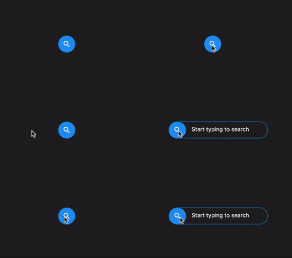
Let’s look at a more complex example of how these widgets can be really useful. We will build a simple search button that is minimised by default as an icon and then expands into a search bar.
class _MyWidgetState extends State<MyWidget> {
  bool isExpanded = false;
  bool isIconClicked = false;

  @override
  void initState() {
    super.initState();
  }

  @override
  Widget build(BuildContext context) {
    const animationDuration = Duration(milliseconds: 250);
    const opacityAnimationDuration = Duration(milliseconds: 150);

    return Scaffold(
      body: SafeArea(
        child: Center(
          child: Padding(
            padding: const EdgeInsets.all(16.0),
            child: AnimatedContainer(
                height: 48,
                duration: animationDuration,
                decoration: BoxDecoration(
                  color: Colors.transparent,
                  border: Border.all(
                    color: isExpanded ? Colors.blue : Colors.transparent,
                    width: isExpanded ? 1 : 0,
                  ),
                  borderRadius: const BorderRadius.all(
                    Radius.circular(24),
                  ),
                ),
                child: Row(
                  mainAxisSize: MainAxisSize.min,
                  children: [
                    GestureDetector(
                      onTapDown: (_) {
                        setState(() {
                          isIconClicked = true;
                        });
                      },
                      onTapUp: (_) {
                        setState(() {
                          isIconClicked = false;
                        });
                      },
                      onTap: () {
                        setState(() {
                          isExpanded = !isExpanded;
                        });
                      },
                      child: AnimatedOpacity(
                        duration: opacityAnimationDuration,
                        opacity: isIconClicked ? 0.7 : 1,
                        child: Container(
                          height: 48,
                          width: 48,
                          decoration: const BoxDecoration(
                            color: Colors.blue,
                            borderRadius: BorderRadius.all(
                              Radius.circular(24),
                            ),
                          ),
                          child: const Icon(Icons.search, color: Colors.white),
                        ),
                      ),
                    ),
                    Padding(
                      padding: const EdgeInsets.symmetric(horizontal: 16, vertical: 6),
                      child: AnimatedContainer(
                        duration: animationDuration,
                        curve: Curves.easeInOut,
                        width: isExpanded ? 200 : 0,
                        child: TextField(
                          onTapOutside: (_) {
                            FocusManager.instance.primaryFocus?.unfocus();
                          },
                          decoration: const InputDecoration(
                            border: InputBorder.none,
                            hintText: 'Start typing to search',
                            hintStyle: TextStyle(color: Colors.white),
                          ),
                        ),
                      ),
                    ),
                  ],
                )),
          ),
        ),
      ),
    );
  }
}

Flutter’s implicitly animated widgets can help add a little life to your app and help enhance user experience, and adding them is very easy too!
If you haven’t already, check out these videos on some of the implicitly animated widgets on the official Flutter YouTube channel:
