Flutter Flexible Widgets: Comprehensive Guide to Using Flexible & Expanded Effectively
Learn how to use Flexible and Expanded to build beautiful UI

Responsiveness is very important when building mobile apps, your UI needs to be able to adapt to different screen sizes without elements looking stretched or out of place.
Flutter provides several useful widgets to tackle this issue, in this article, we will explore Flexible and Expanded and look at some common ways they can be used when building your Flutter apps.
Using Flexible
The Flexible widget lets you scale the size of your elements based on the size of their parent, this is a very easy way of sizing children as a percentage of their parents.
The official Flutter YouTube channel has a great introduction to this widget, check it out!
Let’s start by rendering a simple column that has 3 children:
@override
  Widget build(BuildContext context) {
    return Scaffold(
      body: SafeArea(
        child: Center(
          child: SizedBox(
            height: 400,
            child: Column(
              children: [
                Container(
                  height: 100,
                  width: 100,
                  color: Colors.red,
                ),
                Container(
                  height: 100,
                  width: 100,
                  color: Colors.blue,
                ),
                Container(
                  height: 100,
                  width: 100,
                  color: Colors.purple,
                ),
              ],
            ),
          ),
        ),
      ),
    );
  }
}
Using just the given widgets we would need to use math to add percentage based heights:
@override
  Widget build(BuildContext context) {
    double containerHeight = 400;

    return Scaffold(
      body: SafeArea(
        child: Center(
          child: SizedBox(
            height: containerHeight,
            child: Column(
              children: [
                Container(
                  height: containerHeight * 0.2,
                  width: 100,
                  color: Colors.red,
                ),
                Container(
                  height: containerHeight * 0.2,
                  width: 100,
                  color: Colors.blue,
                ),
                Container(
                  height: containerHeight * 0.6,
                  width: 100,
                  color: Colors.purple,
                ),
              ],
            ),
          ),
        ),
      ),
    );
  }
}
While this is a perfectly fine approach if your UI is this simple, in actual practice you will end up with several such elements that need to scale with the size of their parent.
It is generally a good idea to keep computations in your build method to a minimum, also it is always a good idea to off-load such computations to the framework rather than having to manually do them. This is where Flexible comes in!
The Flexible widget scales its size based on available space, so for example, if you change the above code to wrap the last container with a Flexible and not provide any height, it would result in the same output. You can leverage this behaviour to scale all the children based on the value of flex provided to the Flexible widget.
@override
  Widget build(BuildContext context) {
    double containerHeight = 400;

    return Scaffold(
      body: SafeArea(
        child: Center(
          child: SizedBox(
            height: containerHeight,
            child: Column(
              children: [
                Flexible(
                  flex: 2,
                  child: Container(
                    width: 100,
                    color: Colors.red,
                  ),
                ),
                Flexible(
                  flex: 2,
                  child: Container(
                    width: 100,
                    color: Colors.blue,
                  ),
                ),
                Flexible(
                  flex: 6,
                  child: Container(
                    width: 100,
                    color: Colors.purple,
                  ),
                ),
              ],
            ),
          ),
        ),
      ),
    );
  }
}
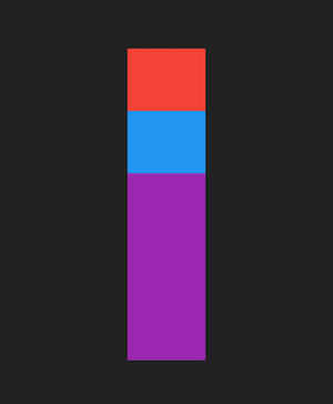
The size of the Flexible is determined by the value of flex, with larger flex values taking more space than others. If all children have a flex value then the entire space provided will be divided in percentages based on the value. In the example above we want the total of flex values to be 10 to make dealing with percentages easier (6 = 60%, 2 = 20% and so on), the output will be the same as the example where we calculate the height of each container.
Pro Tip: The value of flex cannot be in decimals, so a total value of 10 might make it hard to have finer control over percentages (33% for example). If you make sure the total of all flex values is 100 you can get exact percentage values for the size of your widgets.
What if I don’t want to give a flex to all my widgets?
Good question stranger! It is very common to have your UI designed in a way where you have fixed values for some of your widgets and then have the rest of your widgets sized based on available space. Flexible makes this easy!
@override
  Widget build(BuildContext context) {
    double containerHeight = 400;

    return Scaffold(
      body: SafeArea(
        child: Center(
          child: SizedBox(
            height: containerHeight,
            child: Column(
              children: [
                Container(
                  width: 100,
                  height: 170,
                  color: Colors.red,
                ),
                Container(
                  width: 100,
                  height: 170,
                  color: Colors.blue,
                ),
                Flexible(
                  child: Container(
                    width: 100,
                    color: Colors.purple,
                  ),
                ),
              ],
            ),
          ),
        ),
      ),
    );
  }
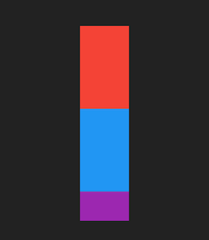
Flexible makes it so that the last container takes up the remaining space.
Using Expanded
Now that we know how the Flexible widget works, there's another useful widget that can serve as an alternative. Flexible widgets have rules and an order to how widgets are laid out, if your UI is relatively simple it can be more effective to skip those layout steps and calculations. For example, if you just needed one Flexible widget to take up the remaining space on your screen, you don’t need the framework to go through all its layout rules.
Instead, use the Expanded widget! If you are unfamiliar with what this widget does you can check out this video on the official Flutter YouTube channel:
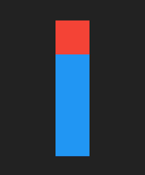
The Expanded widget simply takes all available space. One important distinction between the Flexible and Expanded widgets is that Flexible does not force its children to take the same size as itself whereas the Expanded widget forces its child to take the same size.
@override
  Widget build(BuildContext context) {
    double containerHeight = 400;

    return Scaffold(
      body: SafeArea(
        child: Center(
          child: SizedBox(
            height: containerHeight,
            child: Column(
              children: [
                Container(
                  width: 100,
                  height: 100,
                  color: Colors.red,
                ),
                Expanded(
                  child: Container(
                    width: 100,
                    height: 170,
                    color: Colors.blue,
                  ),
                ),
              ],
            ),
          ),
        ),
      ),
    );
  }
Bonus Widget: Spacer
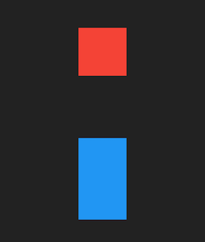
The Spacer widget is similar to the Expanded widget in that it takes up all available space. The key difference is that it doesn't take a child, it just takes up space. So if your UI requires space between elements, Spacer is the way to go.
The official Flutter YouTube channel has a useful video about the Spacer widget:
Flexible and Expanded are widgets you will use a lot when building your apps (and if you don’t, you really should!).


