
Flutter flexible widgets: Column
Flutter provides several layout widgets that help build UI easily. Let's explore how the Column widget can be used and configured to build our apps.


When building mobile applications you often have to work on the the appearance and layout of your UI elements. Flutter provides a rich collection of layout Widgets that help make this process much simpler.
In this article we will go through the essentials of the Column widget in Flutter and experiment with some of the common properties that can be used to configure this widget.
How does the Column widget work?
Column is one of Flutter’s fundamental layout widgets, almost every app will use this widget. The Column widget arranges any children provided to it in a vertical line.
By default this widget always takes all available space in the vertical direction. Without any fixed dimensions, Column will also resize itself based on the size of the screen, allowing you to build responsive layouts.
How to use the Column widget?
Lets look at a very basic usage of Column:
@override
  Widget build(BuildContext context) {
    return Scaffold(
      body: SafeArea(
        child: Center(
          child: Column(
            children: [
              SizedBox(
                width: 100,
                height: 100,
                child: Container(
                  color: Colors.red,
                ),
              ),
              SizedBox(
                width: 100,
                height: 100,
                child: Container(
                  color: Colors.blue,
                ),
              ),
              SizedBox(
                width: 100,
                height: 100,
                child: Container(
                  color: Colors.green,
                ),
              ),
              SizedBox(
                width: 100,
                height: 100,
                child: Container(
                  color: Colors.purple,
                ),
              ),
            ],
          ),
        ),
      ),
    );
  }
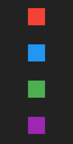
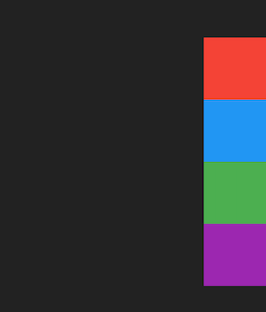
In the code snippet above we have a very simple screen that renders 4 boxes vertically, the output looks similar to this:
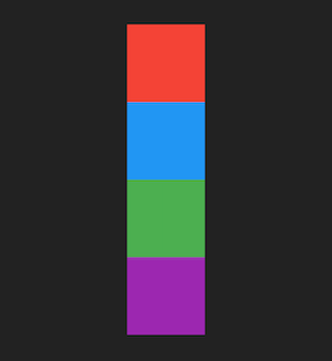
A simple column with 4 boxes
In the example above we use Center and SafeArea for layout but by default children are always laid out from the top, however Column can be configured to change this.
Modifying vertical alignment of the Column
The Column widget accepts a property called mainAxisAlignment which instructs the widget on how to align its children along the main axis. The main axis is the direction along which the widget renders its children, in the case of the Column widget the main axis is vertical.
You can use the following options for mainAxisAlignment :
start
end
center
spaceAround
spaceBetween
spaceEvenly
start , end and center simply align the children along the axis, start being the top edge by default and end being the bottom edge.
spaceAround, spaceBetween and spaceEvenly align the children by applying spacing constraints to them.
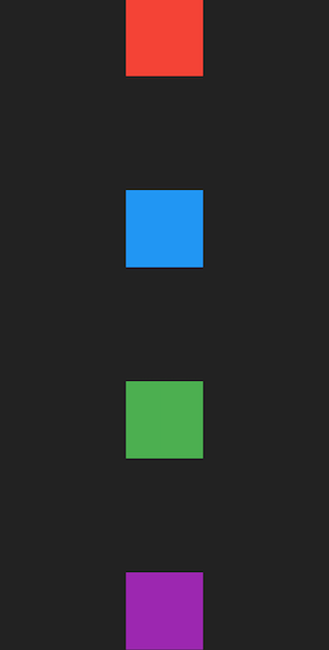
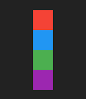
Using MainAxisAlignment.start
This is the default alignment that Column uses:
@override
  Widget build(BuildContext context) {
    return Scaffold(
      body: Center(
        child: Column(
          mainAxisAlignment: MainAxisAlignment.start,
          children: [
            ...,
          ],
        ),
      ),
    );
  }
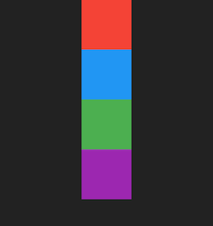
Column that uses main axis alignment start
Using MainAxisAlignment.center
@override
  Widget build(BuildContext context) {
    return Scaffold(
      body: Center(
        child: Column(
          mainAxisAlignment: MainAxisAlignment.center,
          children: [
            ...,
          ],
        ),
      ),
    );
  }
Column that uses main axis alignment center
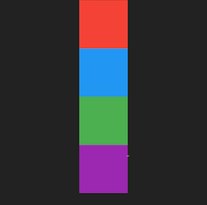
Using MainAxisAlignment.end
@override
  Widget build(BuildContext context) {
    return Scaffold(
      body: Center(
        child: Column(
          mainAxisAlignment: MainAxisAlignment.center,
          children: [
            ...,
          ],
        ),
      ),
    );
  }
Column that uses main axis alignment end
Using MainAxisAlignment.spaceAround
spaceAround applies equal spacing to all children such that all children have equal spacing between them. The remaining space in the Column is then divided equally at the start and end of the Column.
@override
  Widget build(BuildContext context) {
    return Scaffold(
      body: Center(
        child: Column(
          mainAxisAlignment: MainAxisAlignment.spaceAround,
          children: [
            ...,
          ],
        ),
      ),
    );
  }
Column that uses main axis alignment space around
Using MainAxisAlignment.spaceBetween
spaceAround applies equal spacing to all children such that all children have equal spacing between them, but there is no spacing applied to the edges of the Column.
@override
  Widget build(BuildContext context) {
    return Scaffold(
      body: Center(
        child: Column(
          mainAxisAlignment: MainAxisAlignment.spaceBetween,
          children: [
            ...,
          ],
        ),
      ),
    );
  }
Column that uses main axis alignment space between
Using MainAxisAlignment.spaceEvenly
spaceAround applies equal spacing to all children such that all children have equal spacing between them and the same amount of spacing is applied to both start and end of the Column itself.
@override
  Widget build(BuildContext context) {
    return Scaffold(
      body: Center(
        child: Column(
          mainAxisAlignment: MainAxisAlignment.spaceEvenly,
          children: [
            ...,
          ],
        ),
      ),
    );
  }

Column that uses main axis alignment space evenly
Modifying vertical alignment of the Column
Along with mainAxisAlignment the widget also accepts a crossAxisAlignment property. The cross axis is the secondary direction along which the widget renders its children, in the case of the Column widget the cross axis is horizontal.
You can use the following options for crossAxisAlignment :
start
end
center
baseline
stretch
baseline is a little more nuanced and will be skipped in this article.
Using CrossAxisAlignment.start
@override
  Widget build(BuildContext context) {
    return Scaffold(
      body: SafeArea(
        child: Column(
          mainAxisAlignment: MainAxisAlignment.center,
          crossAxisAlignment: CrossAxisAlignment.start,
          children: [
            ...
          ],
        ),
      ),
    );
  }
Column that uses cross axis alignment start
Using CrossAxisAlignment.center
@override
  Widget build(BuildContext context) {
    return Scaffold(
      body: SafeArea(
        child: Container(
          width: double.infinity,
          child: Column(
            mainAxisAlignment: MainAxisAlignment.center,
            crossAxisAlignment: CrossAxisAlignment.center,
            children: [
              ...
            ],
          ),
        ),
      ),
    );
  }
Column that uses cross axis alignment center
In the example above we wrap the Column in a container with infinite width (infinite would make it take screen width in this case). This is because Row and Column take maximum possible size in the main axis but match the size of their children in the cross axis. This means that the Column would always match the width of its children in our example and without the container providing infinite width to the column CrossAxisAlignment.center would have no effect.
Using CrossAxisAlignment.end
@override
  Widget build(BuildContext context) {
    return Scaffold(
      body: SafeArea(
        child: Container(
          width: double.infinity,
          child: Column(
            mainAxisAlignment: MainAxisAlignment.center,
            crossAxisAlignment: CrossAxisAlignment.end,
            children: [
              ...
            ],
          ),
        ),
      ),
    );
  }
Column that uses cross axis alignment end
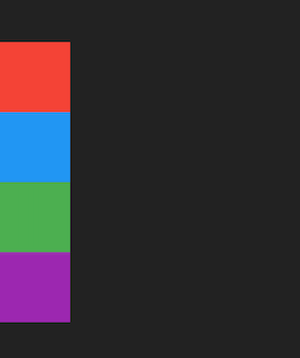
Using CrossAxisAlignment.stretch
stretch forces all children of the Column to take the same height as the Column itself.
@override
  Widget build(BuildContext context) {
    return Scaffold(
      body: SafeArea(
        child: Column(
          mainAxisAlignment: MainAxisAlignment.center,
          crossAxisAlignment: CrossAxisAlignment.stretch,
          children: [
            ...
          ],
        ),
      ),
    );
  }

Column that uses cross axis alignment stretch
stretch also demonstrates the responsiveness properties of Column. Because of its “flexible” nature, when there are no size constraints provided to Column it takes all available space if its children also request unbounded sizes. When you use stretch it tells its children to take up all available space, this results in all children taking the screen width because both the Column and its children would request to take all available space.
Modifying how much space Column takes
Now that we know that Column tries to make as much space as possible by default, we have identified one issue with building our layouts. In our example even though we use Center the items in the Column are still laid out using the top edge of the screen.
This is because the Column has an unbounded height constraint so it uses screen height and by default the alignment along the main axis is the start of the Column.
Column accepts a property called mainAxisSize which controls how much space it takes along the Main Axis (i.e vertical). You can use the following values for mainAxisSize :
min
max
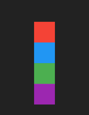
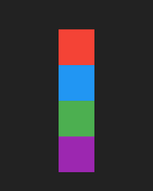
Using MainAxisSize.min
min instructs the widget to constrain its size along the main axis to be equal to the height constraint of its children (including any padding or spacing the children may have)
@override
  Widget build(BuildContext context) {
    return Scaffold(
      body: Center(
        child: Column(
          mainAxisSize: MainAxisSize.min,
          children: [
            ...
          ],
        ),
      ),
    );
  }
Column that uses main axis size min
Because min makes the Column size according to its children, the layout constraints imposed by Center start to work as expected.
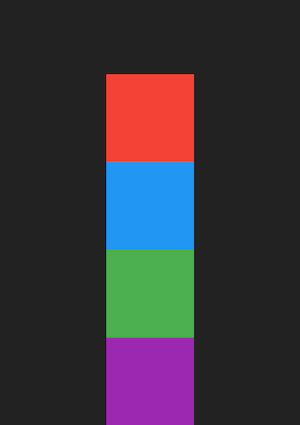
Using MainAxisSize.max
This is the default size that Column uses.
@override
  Widget build(BuildContext context) {
    return Scaffold(
      body: Center(
        child: Column(
          mainAxisSize: MainAxisSize.max,
          children: [
            ...
          ],
        ),
      ),
    );
  }
Column that uses main axis size max
The Column widget is extremely useful when it comes to building mobile applications and with some basic configuration you can use it to create great looking UI really easily!