Creating the YouTube subscribe button animation in Flutter

Everyone knows that good UI/UX is what differentiates an average app from a great app. A reliable way of improving the UX of your app is to use animations that grab the user’s attention without being obstructive or spammy.
YouTube recently added an interaction to their subscribe button where the button’s border animates when the person in the video uses the word “Subscribe”. In this article we will look at how we can build something similar for our buttons using Flutter.
A little background
If you aren’t already familiar with it, Flutter is a cross platform UI framework that let’s you easily build apps for multiple operating systems without having to write platform specific code and it quickly becoming a go to choice for many mobile app developers.
The reason why we are focussing on this specific interaction is because its a really cool idea that seems obvious now if you think about it. One of the problems that YouTube had is that a lot of people watch content without subscribing to the content creator, which in turn affects the quality and consistency of content that creator creates. The issue was not that viewers do not want to subscribe but maybe just forgot to after watching the video or it didnt occur to them to subscribe while watching. By animating the button you quickly grab the user’s attention and highlight your call to action without resorting to in video popups or full screen call to action screens.
The same concept can apply to other mobile apps, often you have a call to action you want user’s to use in the middle of your screen along with other content and often this gets missed. This button animation would be a nice way to make user’s see the CTA and highlight an interaction you want them to make. For example you could highlight a “See more” CTA for some premium content as the user scrolls past that section.
Available for work
If you like this article do check out my other ones, and in case you are looking for help building an app of your own maybe I can help. I work as a freelance mobile developer in my free time. A little shameless plug never hurts right?
Alright now let’s get started!
Setting up the basics
Let’s start by setting up the subscribe button:
class SubscribeButton extends StatefulWidget {
  const SubscribeButton({super.key});

  @override
  State<SubscribeButton> createState() => _SubscribeButtonState();
}

class _SubscribeButtonState extends State<SubscribeButton> {
  @override
  Widget build(BuildContext context) {
    return Container(
      height: 40,
      alignment: Alignment.center,
      width: 140,
      decoration: BoxDecoration(
        borderRadius: BorderRadius.circular(25),
        color: Colors.white,
      ),
      child: const Text(
        "Subscribe",
        textAlign: TextAlign.center,
        style: TextStyle(
          fontSize: 18,
          color: Colors.black,
          fontWeight: FontWeight.w500,
        ),
      ),
    );
  }
}
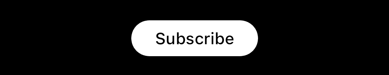
The code is rather straightforward so I won’t walk you through it, although one thing to note is that this is a Stateful Widget because we eventually plan you use animations in it. The code above will render something like this:
An overview of the interaction
Now that we have our button let’s talk about what we plan to do to setup the animation. The animation seems rather simple, on YouTube the buttons border animates itself from left to right with some color. The trick here is that its not animating the entire border together, it appears as if something is moving from left to right behind the button. And that is the key to understanding how to build this.
We want it to seem like something behind the button is moving so that is exactly what we will do! We will add an element behind the button which is slightly larger than it and animate its position to go from left to right. Simple now that you think about it right?
Second let’s talk about details, we want the animation to be quick so it does not look sluggish but also slow enough that people notice it. In this example I’ve chosen 500ms as the duration but you can play around with that for your own use cases. The actual interaction on YouTube uses a gradient for the color, to keep things simple I’m using solid red in this example.
Using AnimationController to animate the button’s border
Let’s start with adding the AnimationController and Tween to our button. If you are not familiar with these I recommend going through their documentation before reading further: AnimationController, Tween.
class _SubscribeButtonState extends State<SubscribeButton>
    with SingleTickerProviderStateMixin {
  late AnimationController _controller;
  late Animation<double> _animation;

  @override
  void initState() {
    super.initState();
    _controller = AnimationController(
      duration: const Duration(milliseconds: 500),
      vsync: this,
    );
    _animation = Tween<double>(begin: 0, end: 1).animate(_controller)
      ..addListener(() {
        setState(() {});
      });
  }

  @override
  void dispose() {
    _controller.dispose();
    super.dispose();
  }
}
The AnimationController is what we will use to start the animation, it simply moves an animation value in the forward or reverse direction. We combine that with Tween to then generate values based on the progress of the animation. Notice that we use SingleTickerProviderStateMixin in our State class now because animations require the implementing class to support Tickers, which ensure that the widget notifies the animation of frame changes making it run smoothly at 60fps. Read about TickerProvider more if you’re curious about this.
Let’s continue and add the highlight around the button:
@override
  Widget build(BuildContext context) {
    return Container(
      height: 50,
      width: 150,
      decoration: BoxDecoration(
        borderRadius: BorderRadius.circular(25),
      ),
      clipBehavior: Clip.hardEdge,
      child: Stack(
        alignment: Alignment.center,
        children: [
          Positioned(
            left: 0,
            child: Container(
              height: 50,
              width: 25,
              color: Colors.red,
            ),
          ),
          renderSubscribeButton(),
        ],
      ),
    );
  }
The idea here is that we have a container around the button and then add a sibling to the button which will act as the moving widget behind it. Also to keep things more organised I moved the button itself to a separate function:
Widget renderSubscribeButton() {
    return GestureDetector(
      onTap: () {
        _controller.reset();
        _controller.forward();
      },
      child: Container(
        height: 40,
        alignment: Alignment.center,
        width: 140,
        decoration: BoxDecoration(
          borderRadius: BorderRadius.circular(25),
          color: Colors.white,
        ),
        child: const Text(
          "Subscribe",
          textAlign: TextAlign.center,
          style: TextStyle(
            fontSize: 18,
            color: Colors.black,
            fontWeight: FontWeight.w500,
          ),
        ),
      ),
    );
  }
Notice that I’ve wrapped the button with a GestureDetector so that we can start the animation when we tap it. This is just for the sake of this example and you can choose any other event you prefer for your use case. The button should now look like this:
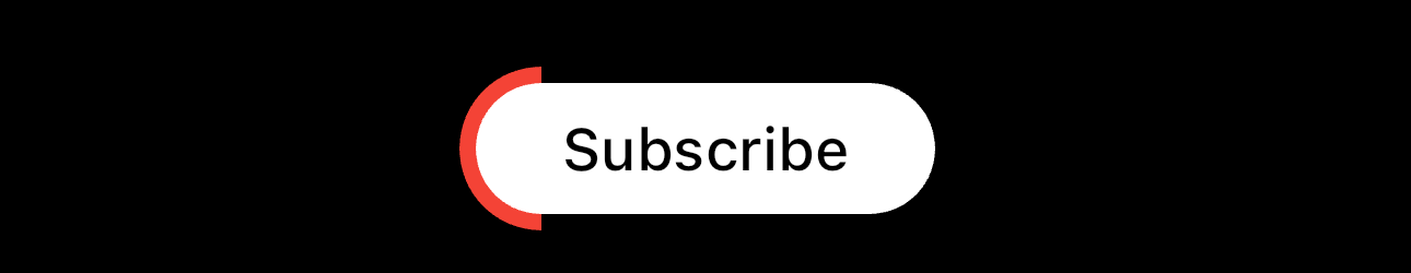
The widget in red is what we will be animating from left to right to make it appear as if the border is being animated. Now let’s talk about a few minor details before we hook up the animation.
The idea here is that we will modify the left property of the Positioned widget to animate the position of the red widget. The width of the button is 150 and the width of the red widget is 25, so we need to move the widget from -25 to 175 ( 0–25 to 150+25). So we need to do the following:
Modify the Tween to use the
-25as the starting position and175as the end.Modify the Positioned widget to use the animation value as the
leftvalue
late double highlightWidth = 25;

@override
void initState() {
  super.initState();
  _controller = AnimationController(
    duration: const Duration(milliseconds: 500),
    vsync: this,
  );
  _animation = Tween<double>(begin: 0 - highlightWidth, end: 150 + highlightWidth).animate(_controller)
    ..addListener(() {
      setState(() {});
    });
}
I created a variable highlightWidth to make it easier to play around with the width of the red widget.
Positioned(
  left: _animation.value,
  child: Container(
    height: 50,
    width: highlightWidth,
    color: Colors.red,
  ),
),
_animation.value will output the value of the Tween as the animation progresses and because we call setState whenever the animation value is updated the UI will reflect this as well. This is how the interaction looks now:
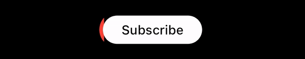
And thats it! We now have a border animating behind the button on demand. You can play around with the color of the red widget, its width, the animation duration etc to give you the exact interaction you need.
Things to keep in mind
Interactions like this are best suited for small buttons in your screen, full width buttons grab enough attention by themselves and adding this interaction to that might make it annoying for users.
Do not overuse this animation in your app and use it on some of the most important CTAs in your app only.
Thanks for reading! If you like this article be sure to check out my other work. Also it always helps if you share this with other people.


