


In this article, we’re going to look at all the different ways to lay out and navigate between different features in your Flutter apps.
Flutter’s pretty awesome for building apps that work everywhere — phones, computers, you name it. And a big part of making these apps user-friendly is getting navigation right.
This article won’t cover navigation between screens, instead we will cover options for how to design your UI to account for navigation in some common cases. So let’s start by discussing some of the factors involved behind making such a decision.
Intuition: It is very important for your app’s designed to be as intuitive as possible, user’s not being able to understand your app is a big reason behind uninstalls. Onboarding and tutorial screens help but that extra effort can be focussed elsewhere if your user already knows their way around the app.
A really simple way to make it easier for users to understand your app is by designing it in way thats consistent with the default apps that come with the operating system. Material components are a good way to build your app following Google’s design conventions. Similarly Cupertino widgets are a great way to make your app look and feel like the built in iOS apps. Having a custom design language to make your app consistent on all platforms is very tempting but may not always be the best solution.User experience: Depending on your app the layout you choose matters a lot when it comes to experience. If you have many screens in your app and you present the user with too many options, it can be overwhelming which results in confusion and eventually to them not using the app out of frustration. In the same way, offering user’s very few options up front which results in them having to interact with nested choices may lead to too many clicks or a lack of understanding making your app feeling either too cumbersome to use or too confusing.
Feature priority: If you have multiple features in your app you may want users to interact with specific ones more than others, maybe these are paid features or just features that you feel add more value to the user. In cases like these it is important to decide how to lay out your app so that the relevant items capture the user’s attention.
Let’s take a look at a couple options and discuss when they can be useful:
Tab Bar Navigation
This usually involves a number of tabs either on the bottom (common in iOS apps) or the top (more common in Android) of the screen that lets user’s switch between features easily. This pattern is best used when you have a small set of equally important features on the same screen that you want users to easily access. Bottom tab bar based layouts are great for UX because the user’s thumb can easily reach the tabs.
Design principles
Tab based navigation usually involves a series of icons as tabs that the user can interact with. based on the number of tabs, icons may also be accompanied by a label.
The tab bar has limited space and should only be used for a small number of features. Clutter in the tab bar leads to really bad UX.
Icons in the tab bar should be properly spaced to avoid accidental clicks to neighbour items.
The tab bar should clearly indicate what the currently active tab is.
The tab bar should be static and not require users to scroll to see more options. If you have too many options, the tab bar is not the right layout for you.
Example
In this example we will be using a Cupertino style tab bar, you can refer to the official Flutter documentation to know how to use the material tab bar.
class MyHomePage extends StatelessWidget {
  const MyHomePage({super.key});

  @override
  Widget build(BuildContext context) {
    return CupertinoTabScaffold(
      tabBar: CupertinoTabBar(items: const [
        BottomNavigationBarItem(
          icon: Icon(CupertinoIcons.home),
        ),
        BottomNavigationBarItem(
          icon: Icon(CupertinoIcons.settings),
        ),
      ]),
      tabBuilder: (builderContext, position) {
        return CupertinoTabView(
          builder: (tabViewContext) {
            return Center(
              child: Text('Tab $position'),
            );
          },
        );
      },
    );
  }
}
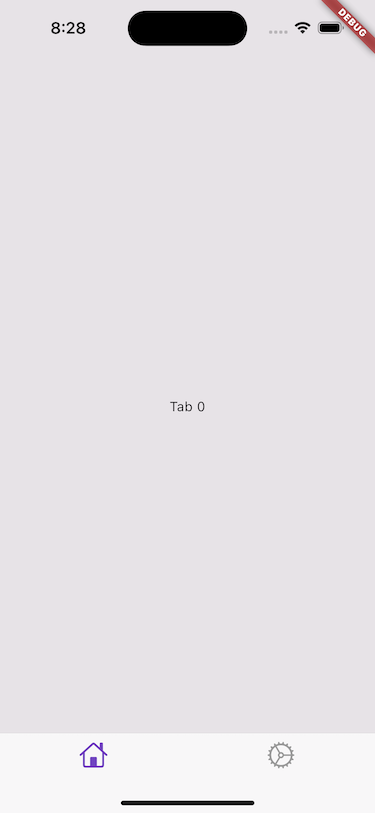
This example would look like this:
Carousels
Carousels are horizontal scroll based layouts where the user swipes to switch between views. These are often used for features such as onboarding, photo galleries etc. Carousels can be full screen or a percentage height, typically each individual view of a carousel is full width but you can have them be slightly smaller to make it evident that there is a next item that can be scrolled to.
iOS typically has paged carousels, meaning you always fully scroll to the next item even if the user only scrolls partially. Generally if the user does only partially scroll to the next item you should automatically scroll such that the item is fully in view.
When you have a few items in the carousel (for example in your onboarding flow) it is a good idea to also add an indicator with your carousel that informs users about how many items there are and has a way to show what position they are currently at. If you have many items (let’s say a photo gallery) including an indicator will just add clutter, in this case its better to add some sort of actions (arrows for example) that lets users trigger a scroll to the next item and then disable that action visually to indicate that they have reached the end.
Carousels are best used when you want to lay out more than 2–3 items (at least 3) horizontally. You should use a tab bar instead of a full screen carousel if you have 2–3 items that are independent features.
Design principles
The default action to move between items should be user interaction (scroll or click)
Be careful not to have conflicts with gestures in the same screen, for example swiping your carousel should not accidentally trigger swiping between tabs.
Infinite scrolling/paging are a good way to enhance the UX of your carousels
Carousels are best used for swiping between items that are similar and have the same context to the user. Using them for independent features should be avoided if possible because overuse of such carousels lead to confusion and make navigation in your app less intuitive.
Items in your carousel should not negatively affect the smoothness of the scroll/animation between items. Any computationally intensive or I/O operations should be made in a way where they don’t block the primary UI thread.
If items in the carousel are loaded over network calls, appropriate placeholders should be used to avoid making the content appear blank as the user interacts with it.
Example
While you can create a carousel from scratch in Flutter you can also use a library created by someone else to implement some of these design patterns. For example at the time of writing carousel_slider was one of the more popular libraries on pub.dev for carousels in Flutter.
Segmented Control
This pattern is something that is used mainly in iOS and other Apple frameworks. Segmented control involves separating your view in separate segments that the user can toggle between using some controls. This type of pattern is useful when you need to separate your layout but the different segments all share the same context (for example switching between missed and normal calls in the phone app).
While Flutter allows you to implement this in Android it may not be a good idea if the rest of the app follows the normal material guideline because it would feel out of place.
Common use cases of segment controls include filtering content, switching between different views for the same data (list and map views for example) etc
Design principles
Segment control should only be used for a small number of options, typically not more than 4.
Because users can also swipe between the controls, it adds to the delight factor of using your app.
The control is typically compact and allows for more real estate for the actual content of your app.
The layout is very straightforward and is designed to be very intuitive.
The labels for the controls should be very clear and single worded so users can easily identify how to interact with them.
The selected segment should be highlighted clearly.
Example
In this example we use CupertinoSlidingSegmentedControl but you can use SegmentedButton if you want a more material look for your app.
class _MyHomePageState extends State<MyHomePage> {
  String selectedIndex = '1';

  @override
  Widget build(BuildContext context) {
    return Scaffold(
      body: SafeArea(
        child: Center(
          child: Column(
            children: [
              CupertinoSlidingSegmentedControl(
                groupValue: selectedIndex,
                children: const {
                  "1": Text("First"),
                  "2": Text("Second"),
                },
                onValueChanged: (value) {
                  if (value != null) {
                    setState(() {
                      selectedIndex = value;
                    });
                  }
                },
              )
            ],
          ),
        ),
      ),
    );
  }
}
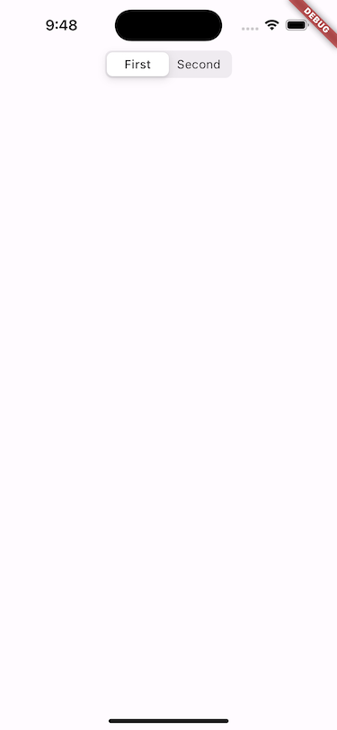
This will render the following:
Stories
Stories is inspired by popular social media apps but have since become a popular design pattern. Stories are a popular way of showcasing content in a sequential and immersive way, useful for showing content such as tutorials, guides, product showcases etc.
Design principles
Stories are designed for content to be displayed for small periods of time and switching between stories when the time is elapsed.
Users should be allowed to switch between stories by tapping or swiping.
Stories are designed for visually engaging content such as images or videos.
Easy navigation between items is a big boost to UX.
Because stories are usually full screen, they are a good way to drive engagement to the content you want users to focus on.
Because stories are a staple for social media apps, it helps increase the appeal of your app with younger audiences.
Example
At the time of writing this article, story_view was one of the more popular libraries for adding stories like layout to Flutter apps.
There are plenty more options when it comes to design patterns for navigation UI, you can pick and choose or combine multiple ones to design really good looking apps. The key to choosing between them it to maintain clarity and ease of use for your users while keeping the general usability of your app as intuitive as possible.